Why Floating Media Walls Feel So Modern
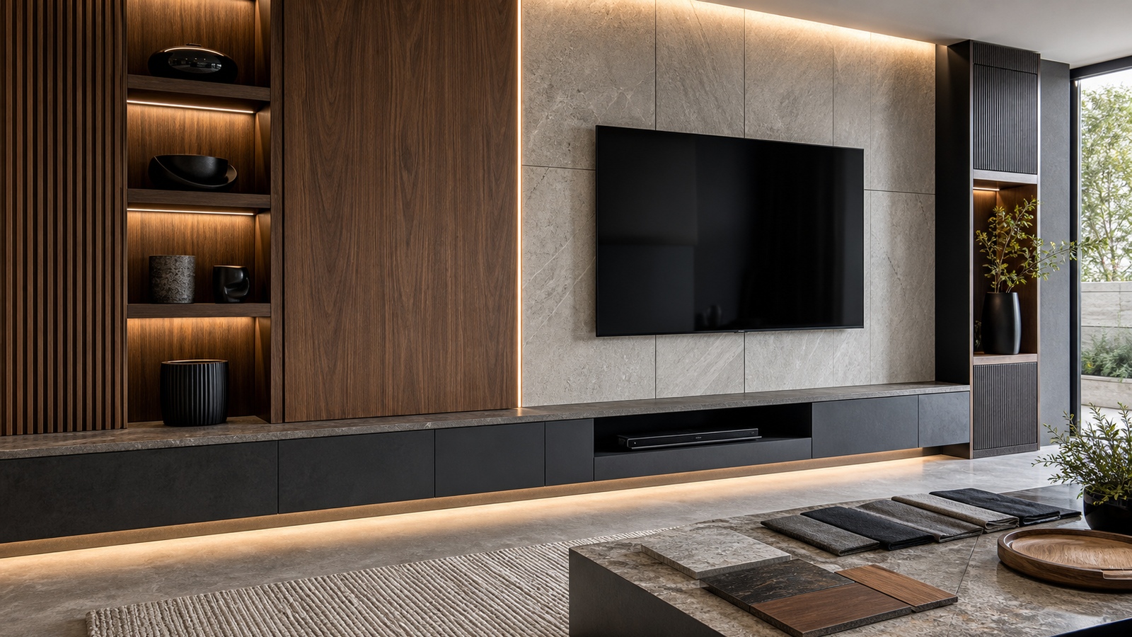
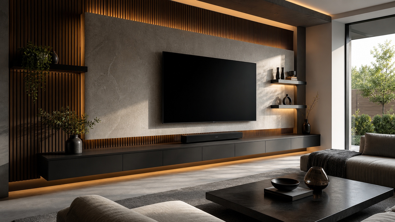
A floating media wall creates impact by removing visual weight. Cabinets lift off the floor, shelves seem to hover, panels align with shadow gaps, and the display becomes part of a larger architectural composition. The look is clean, but it is not simple by accident. A successful floating wall depends on structure, proportion, cable planning, and restraint. When those details work together, the room feels larger, the screen feels more intentional, and the entertainment zone becomes a design feature instead of a cluster of equipment.
The Illusion Depends on Real Structure
Floating media walls look effortless because the support is hidden. Behind that clean effect, the wall may need blocking, anchors, brackets, or a reinforced mounting system. The cabinet, display, speakers, and stored items all add weight. A floating design should never rely on hope or drywall alone.
Planning structure early also protects the finished look. If supports are considered after the panels are built, the installer may need visible brackets or awkward fixes. When framing, blocking, electrical locations, and cable routes are coordinated from the beginning, the wall can carry weight while still looking light.
This is one area where professional help can be worth the money. A floating media wall is both furniture and installation. It must look precise, hold safely, and allow service access. The cleaner the design appears, the more important the hidden work becomes.
Proportion Matters More Than Size
A floating wall does not have to be large to make an impression. What matters is the relationship between the screen, base cabinet, side panels, shelves, and open space. If the base cabinet is too thick, it can look heavy even when lifted. If shelves are too thin or too long, they may appear fragile. If the screen is too high, the whole composition feels forced.
Strong designs usually include breathing room. A reveal above the cabinet, open floor below, and clear margin around the display help the wall feel composed. Negative space is not wasted space; it is what allows the floating effect to register.
Lighting Makes the Wall Feel Dimensional
Shadow is part of the floating look. Under-cabinet lighting, soft backlighting, and recessed shelf lighting can emphasize the separation between the wall and the lifted elements. The goal is not to outline every edge with bright LEDs. Subtle light creates depth and makes the wall feel like it belongs to the room.
Placement is critical. Lights should not reflect directly on the screen or create glare from glossy surfaces. Warm, dimmable sources usually feel more refined than strong colored effects. If the wall includes stone, wood, or fabric, lighting can reveal texture without making the material look busy.
A good lighting plan also changes the room’s mood when the display is off. The media wall becomes an evening feature, not just a screen holder. That is part of why floating installations have become popular in open living spaces.
Storage Has to Stay Quiet
Floating designs can lose their elegance if storage becomes too visible. Closed drawers, push-latch doors, and careful cable exits help preserve the clean lines. The wall should hide the routine mess of media equipment while keeping the items people use often within reach.
- Keep heavy storage low so the wall still feels grounded.
- Use shallow drawers for remotes, chargers, and controllers.
- Plan ventilation before closing electronics behind panels.
- Leave one accessible route for future cable replacement.
A floating wall should not be so minimal that it becomes impractical. The best installations combine visual lightness with real storage capacity.
Materials Define the Mood
Floating walls can lean warm, dramatic, minimal, or gallery-like depending on material choices. Wood veneer softens the technology. Matte painted panels feel architectural. Stone-look slabs add permanence. Acoustic fabric can hide speakers while controlling sound. Metal trim can sharpen the edges, but too much shine may introduce reflections.
The finishes should support the screen rather than compete with it. High-contrast veining, glossy panels, or busy shelves can look impressive in daylight and distracting during a movie. A restrained material palette often ages better and keeps attention where it belongs.
The big impact of a floating media wall comes from precision. Straight reveals, aligned joints, hidden wiring, and comfortable viewing height make the design feel expensive. Clean lines are unforgiving, but when executed well, they turn a practical entertainment wall into the visual anchor of the room.
Sightlines Still Decide Whether the Wall Works
A floating media wall can become so focused on composition that viewing comfort gets pushed aside. The screen should still be placed for seated eye level, reasonable distance, and the main viewing positions. If the display floats too high because the cabinet line demanded it, the room may photograph well but feel tiring during a long movie.
Sightlines also affect the depth of shelves and cabinets. A shelf that looks dramatic from the entry may cast a shadow, reflect light, or distract from the screen when viewed from the sofa. Before finalizing the design, sit where people will actually watch and study the wall from that height.
The strongest floating walls look architectural without forgetting they are used for entertainment. The screen is part of the design, but it is also the reason the wall exists.
Precision Is the Real Decoration
Floating media walls do not need much ornament because alignment carries the design. Even gaps, level shelves, straight seams, centered mounts, and consistent reveals create the sense of craft. Small errors are more visible in a minimal installation because there is no decorative clutter to distract from them.
This makes measurement and installation sequencing important. The cabinet, display, lighting, and panels should be coordinated so edges relate to one another. If a soundbar, shelf, or screen sits slightly off, the whole wall can feel unsettled. Precision gives the design its quiet confidence.
A budget version can still feel high-end if the lines are clean. Conversely, expensive materials can look ordinary if the reveals wander or the display height feels accidental.
Plan Cleaning and Service Before the Wall Is Finished
Floating designs often have shadow gaps, under-cabinet spaces, and recessed surfaces that collect dust. They may also hide lighting drivers, power supplies, streamers, and speakers. If no one can reach those areas easily, the wall becomes frustrating over time.
Removable panels, accessible outlets, and practical cleaning clearances should be part of the design. A floating cabinet installed too close to the floor may be hard to clean beneath. A beautiful light channel may be impossible to repair if the driver fails. The more seamless the wall appears, the more carefully service should be planned.
Long-term impact depends on maintenance. A floating wall that remains clean, level, and easy to update will keep its big visual effect for years.
A Floating Wall Needs a Grounding Element
The word floating can make people think everything should feel weightless, but a room still needs grounding. A floating media wall works best when the lifted elements are balanced by something visually stable: a low cabinet, a strong material panel, a rug, a centered seating group, or a darker screen zone. Without that anchor, the wall can feel decorative rather than integrated.
Grounding also helps with scale. A very thin floating shelf beneath a large display may look underpowered. A base cabinet that is too massive may defeat the floating effect. The goal is to create enough visual weight to make the wall feel intentional while leaving enough open space for lightness.
The surrounding room contributes to this balance. If the furniture is heavy and traditional, a severely minimal floating wall may feel disconnected. If the room is spare and modern, a busy floating composition may feel excessive. The wall should sharpen the room’s identity, not argue with it.
This is where mockups and tape lines can help. Mark the cabinet height, screen position, shelf length, and open gaps on the wall before building. View the marks from the entry, sofa, and side angles. The right proportions often become obvious once they are seen at full scale.
A floating media wall has big impact because it combines engineering with restraint. When the structure is strong, the lines are precise, the screen sits comfortably, and the room has a visual anchor, the wall feels both dramatic and calm.
Coordinate the Wall With the Rest of the Room
A floating media wall can look isolated if it is designed without the surrounding room in mind. The cabinet finish should relate to flooring, tables, shelving, or trim. The lighting temperature should match nearby lamps. The wall’s horizontal lines should not fight the height of windows, fireplaces, or adjacent built-ins. Clean lines have more impact when they belong to a larger composition.
Furniture placement is part of that coordination. If the sofa is too far off center, the floating wall may feel like a display in a showroom rather than the heart of the room. If a rug is too small, the wall can appear detached from the seating area. If side chairs block the view from secondary seats, the room may look better than it works.
The floating effect can also be echoed subtly elsewhere. A slim shelf, lifted sideboard, or shadow-line detail can make the media wall feel connected without copying it exactly. Repetition should be gentle. Too many floating pieces can make a room feel weightless and impractical.
When the wall and room support each other, the impact feels natural. The media wall becomes the strongest feature, but not the only designed element.
Lightness Should Never Feel Fragile
A floating media wall succeeds when it looks light but feels secure. The viewer should sense precision, not risk. That comes from proper structure, balanced proportions, clean cable planning, and materials that can handle daily use.
The design should also remain practical after the first reveal. Doors need to open, devices need to breathe, surfaces need to be cleaned, and the screen may eventually be replaced. If the wall cannot handle those ordinary demands, the floating effect becomes a liability.
The strongest floating walls combine visual lift with real confidence. They make the room feel open while quietly doing the heavy work behind the surface. That confidence should be visible in the details: even reveals, straight sightlines, doors that open cleanly, lighting that does not glare, and storage that can be reached without disturbing the composition. When those details are right, the wall feels dramatic without feeling delicate. It becomes an architectural feature that still behaves like practical furniture, which is the balance a modern media room needs. A floating wall should impress from across the room and still make sense when someone opens a drawer, changes a cable, or cleans beneath the cabinet. If beauty and maintenance are both planned, the installation keeps its crisp effect long after the first week. That is the difference between a visual trick and a lasting design feature, especially once daily use begins and the room has to perform.
That final phrase matters because floating walls are not only viewed from one perfect angle. They are lived with from the sofa, the entry, the hallway, and the floor beneath the cabinet.
TV Top 10 Product Reviews
Explore Philo Street’s TV Top 10 Product Reviews! Discover the top-rated TVs, access comprehensive reviews, and find the perfect screen for your space.