Digital Menus Make Service Easier to Understand
Digital menus improve speed and service because they bring the restaurant's offer closer to the real moment of ordering. Guests can see what is available, what is featured, how choices are organized, and where their attention should go before they reach the counter or server. Staff gain a menu surface that can change with the daypart, inventory, rush level, and kitchen capacity. When digital menus are designed well, they do not merely look modern. They reduce hesitation, repeated questions, outdated information, and avoidable friction in the dining space.
The Ordering Line Is a Design Problem
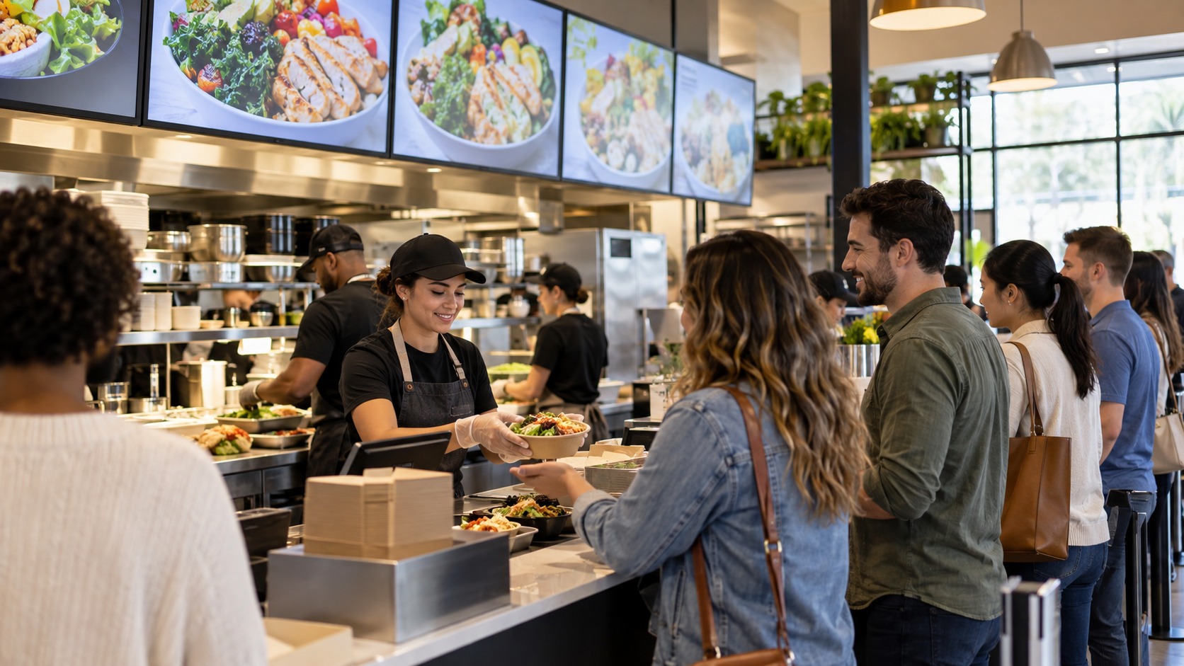
A slow line is not always caused by slow staff. Often the problem begins before the guest speaks. People reach the counter without knowing the menu structure, discover unavailable items too late, scan too many choices at once, or ask basic questions because the information is not visible where decisions happen. Digital menus help by moving decision-making upstream.
The most useful screens are positioned so guests can start narrowing choices while they wait. By the time they order, they should already understand the main categories, featured options, price ranges, and any limited-time items. That early clarity makes the interaction at the counter shorter and friendlier.
Speed Comes From Fewer Surprises
Digital menus improve speed because they reduce surprises. A sold-out item can be removed quickly. A breakfast menu can become a lunch menu without staff climbing ladders or taping paper over old signs. A special can appear during its actual service window and disappear when the kitchen can no longer support it.
This is especially valuable in dining spaces with tight rush periods. If the kitchen needs to simplify choices for twenty minutes, the visible menu can emphasize fast-moving items. If a seasonal drink is driving demand, it can receive more visual weight. A printed menu is fixed until someone replaces it. A digital menu can follow the operation.
Better Hierarchy Creates Better Service
A digital menu is only faster if it is easier to read. Many restaurants use screens but still overload them with dense text, tiny prices, rotating panels, and too many competing highlights. Guests should not have to wait for a carousel to return before they can decide. Essential ordering information needs to be present, stable, and grouped logically.
Hierarchy begins with the guest's likely question. What kind of meal is this? What are the main choices? What can be customized? What costs extra? What is popular or seasonal? When the display answers those questions in order, service becomes smoother because staff can focus on hospitality and specific needs instead of reconstructing the menu out loud.
Digital Menus Help Staff Stay Aligned
Staff alignment is one of the quiet advantages of digital menus. When the screen, register, kitchen, and service team all reflect the same offer, fewer awkward corrections happen. A cashier does not have to explain that an old sign is wrong. A runner does not have to handle pickup confusion caused by unclear instructions. A manager can adjust information once and know it has reached the visible menu.
New employees also benefit. They learn the menu structure from the same presentation guests use, which makes their explanations more consistent. If the menu board is confusing to staff, it will almost certainly be confusing to guests.
Placement Changes the Result
Digital menus should be placed according to behavior, not only wall availability. A preview screen belongs where guests join the line. A final ordering screen belongs where guests speak to staff. A pickup screen belongs away from the ordering decision so waiting guests do not block new orders. When these functions are mixed together, the space becomes harder to read.
Lighting and angle matter as much as location. Glare from windows, reflections from tile, and screens mounted too high can erase the speed advantage. The menu must be tested from the back of the line, from shorter eye heights, and during real daylight conditions.
Menus Should Not Become Advertising Walls
Restaurants sometimes turn digital menus into promotional canvases because the technology makes it easy. The problem is that guests in line are trying to make a decision. If the menu keeps switching to brand messages, lifestyle videos, or unrelated promotions, guests may reach the counter less prepared than before.
Promotions belong in the system, but they need discipline. A featured item can have visual emphasis. A seasonal offer can occupy a defined zone. A slow rotation can support discovery. The core menu should remain dependable.
The Best Digital Menus Feel Calm Under Pressure
A well-designed digital menu does its best work during pressure. Lunch is busy, staff are moving, guests are hungry, and the kitchen has limits. In that environment, the display should feel calm, current, and easy to scan. It should help guests order with confidence and help staff serve without constant corrections.
That is why digital menus have become more than a visual upgrade. They are part of the service system. When they are clear, governed, and placed well, they improve both speed and hospitality.
Menu Boards Should Match Kitchen Reality
A digital menu can promise speed only if it respects what the kitchen can actually produce. During a rush, every promoted item has operational consequences. A visually emphasized dish may create prep pressure. A customization-heavy item may slow the line. A special that depends on one station can create a hidden bottleneck. The menu board should not be designed separately from kitchen capacity.
The best operators review digital menu performance with both front-of-house and back-of-house teams. If guests order more efficiently but the kitchen falls behind, the system has moved the delay rather than solved it. If menu changes reduce questions but increase mistakes, the hierarchy may be too simplified. Digital menus are most valuable when they help the whole service chain, from first glance to fulfilled order.
Decision Architecture Matters More Than Animation
Many restaurants focus on motion because motion is visible. A sliding panel, a glowing special, or a video loop can make the system feel alive. Yet speed usually comes from decision architecture: the order of categories, the grouping of choices, the clarity of modifiers, and the removal of unnecessary options at the moment of ordering. Animation can support those decisions, but it cannot replace them.
A useful menu board helps guests answer one question at a time. What category am I in? What are the main options? What is featured? What choices do I need to make? What will it cost? If those answers are stable and easy to scan, the line moves. If the board keeps changing before the guest can finish reading, motion becomes a service problem.
Digital Menus Can Improve Equity in the Line
Ordering can be stressful for guests who need more time, speak another language, have dietary restrictions, or are unfamiliar with the cuisine. A clear digital menu gives those guests a chance to prepare before they reach the pressure point. Larger type, visual grouping, allergen cues, and multilingual modes can make service feel less intimidating.
Equity also includes physical visibility. A menu that is readable only by tall guests at the front of the line is not doing its job. Restaurants should test sightlines from varied heights and distances. They should consider glare, crowding, and whether a guest using mobility equipment can see the same information without being pushed aside. Faster service should not mean designing only for the fastest reader.
The Best Systems Include a Human Override
Live service always produces exceptions. A delivery arrives late, a station falls behind, a power flicker resets a display, or a guest needs help interpreting an option. Digital menus should make the standard path smoother while leaving room for staff judgment. Operators need a simple way to remove items, pause promotions, or switch to a limited rush menu without waiting for a vendor.
That authority should be controlled but practical. If only one off-site person can make an urgent menu correction, staff will invent workarounds during service. If everyone can change the menu freely, accuracy and brand consistency suffer. The right model gives trained managers clear permissions, documented rules, and backup procedures. Guests experience that governance as confidence.
Better Menus Create Better Guest Behavior
Guests behave differently when a menu is easy to understand. They step into the line with more confidence, ask more specific questions, and make fewer rushed corrections at the register. They are also more likely to notice the items the restaurant wants to feature because those items are presented within a clear structure. A digital menu cannot force good behavior, but it can remove many of the conditions that create hesitation.
This is important because staff often absorb the cost of poor menu design. When guests cannot see the board, staff repeat categories. When prices are unclear, staff handle surprise. When items remain visible after selling out, staff apologize. When modifiers are hidden, orders require extra back-and-forth. A better digital menu protects staff energy and lets them spend more attention on warmth, accuracy, and problem-solving.
Restaurants should review menus from the guest's side of the counter. Stand where the line begins. Look up while people are moving. Notice whether the menu's first message is obvious. Watch whether guests know where to wait after ordering. Ask staff which questions they still answer all day. Those observations often reveal improvements that software dashboards miss.
Digital menus improve speed and service when they make the dining space more legible. The technology is visible, but the real achievement is a line that feels calmer, a staff that sounds less repetitive, and a guest who reaches the counter ready to order.
Training Turns the Menu Into a Shared Tool
Digital menus work better when staff are trained to use them as part of service. A cashier can reference the board to explain a combo, a host can point out where specials appear, and a manager can tell the team when an item has been removed. Without that shared understanding, the menu becomes something guests see but staff work around.
Training does not need to be complicated. Staff should know what each screen shows, what changed that day, which items are being emphasized, and what to do if the display is wrong. They should also be invited to report confusion. Front-line employees quickly learn which menu labels slow guests down and which visuals prompt useful questions. Their feedback can make the digital menu sharper over time.
Good Service Still Sounds Human
A faster menu should not make service feel mechanical. Guests still appreciate a greeting, a recommendation, and a moment of patience when they need it. The goal is not to remove conversation from dining spaces. The goal is to remove the repeated explanations that make staff sound rushed and guests feel unprepared.
When the menu handles basic clarity, staff can focus on the human layer: confirming preferences, helping with dietary needs, suggesting a favorite, or smoothing over a delay. That is why the best digital menu systems feel hospitable. They give people better information so the conversation at the counter can be more natural.
TV Top 10 Product Reviews
Explore Philo Street’s TV Top 10 Product Reviews! Discover the top-rated TVs, access comprehensive reviews, and find the perfect screen for your space.